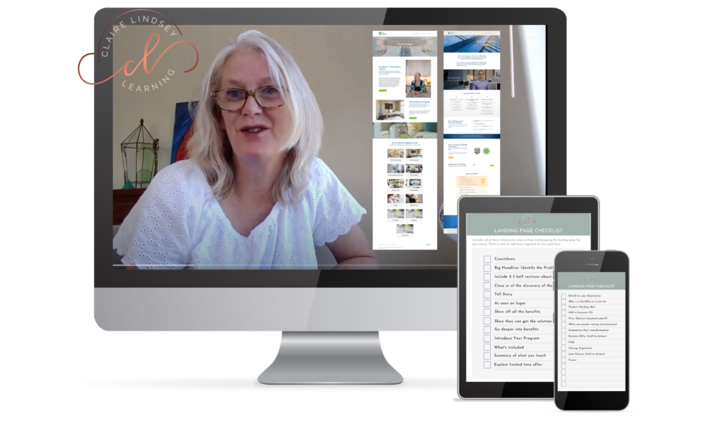
The Thinkific SiteBuilder can be confusing at first, but once you find some Tips and Hacks for creating compelling SiteBuilder Blocks, you can design an effective sales page. I recently hosted an Experts Corner on the Thinkific for online course creators FaceBook Page. I provided the above training highlighting my Top Tips for working with the Thinkific SiteBuilder to create an effective Landing Page for your course. You can watch the training below and check out the Tips in this article and my new course on Thinkific, SiteBuilder Savvy.
Video Feedback

SiteBuilder Considerations and Tips
- To get a pleasing design flow on your landing Page, use a photo in the header, then a section with a white background, then a section with a textured background, then a white background. Repeat this design rhythm as you tell the story of your course. You can find photos at unsplash.com or pexels.com
- Create texture backgrounds that match your brand colors and use them to break up your landing page. The large text that act as subtitles telling/selling the story of how you course can help and why students should enroll. Texture backgrounds can be made with Canva and then using a color overlay in the site builder. Another option is to search by color for photographs and these results often have images that work well as background images.
- Be careful with adding a curriculum block. If you are not careful you may give away some secrets that reside inside your courses. You have to get creative sometimes with the names of your modules as they will be publicized on the front page of your course. In Thinkific I use the Frequently Asked Questions Block and change it to reveal certain aspects of my curriculum.
- Sections on your course landing page should include,
- A hook (why someone would want your course),
- The story of why you designed the course,
- An outline of the problem people have before they take your course.
- Then hint at how your course will help students overcome that problem you outlined previously.
- Detail the results that students will get.
- Reassure them that they will be able to do it easily,
- Identify some bonuses
- Name your sections and copy them from one page to another. Once you have a section with a texture background then you can copy it and customize for each course landing page.
- Use screenshots and canva to create content mockups (or buy ready made mockups on Canva and use the image gallery to show what your course includes. I have a video about mockups on Youtube here.
- Add white space between sections by adding a header section and them removing everything from it and making it small. You can also add dividers to these spacers if you need to.
- Use a three image section to break up the landing page. Alternate the images backgrounds to create visual interest. Use a quote image surrounded by two picture images for example. Make sure the quote image works well on a mobile, you may have to play around with the size of the quote in Canva to get it to a size that plays nice on different screen sizes.
- Pay attention to which blocks allow you to change the background image. Remember, these can be customized to create visual interest as you move down the page. I like to use a pattern of blocks. Image background, light background, texture background, light background, image background and repeat.
- Scanning the page should draw readers in to the more detailed copy sections.

Site Builder Savvy Course
To help you create an effective course site, my Thinkific SiteBuilder Savvy course is now available on introductory price. You can check it out here.
All of the designs I create for clients are featured on my Thinkifc Landing Pages site, when you click on close up you can see the detail on each design.
To see how I use the additional products sitebuilder block to feature a specific course or bundle jump to this latest post.
GET INSTANT ACCESS TO FREE MINI -TRAINING “ROADMAP TO A PROFITABLE COURSE”


Wow thanks this was exactly what I needed today.
Glad it helped!
Pingback: Non-Profit Pivoted to Online Learning to Stay Relevant